Pages

Sunday, 26 October 2014

INBOX by Gmail

Gmail has introduced an all new revamped function called the Inbox. 


The first thing to understand about the new Inbox by Gmail (or just Inbox) is that it is not just a new user-interface slapped on top of the old Gmail.  It is a completely different way to manage one's e-mail account.  It is not intended to be equivalent to Gmail.  It is simpler, with less configurable options, and provides a more consistent look-and-feel across all supported browsers and mobile devices. But it also maintains the core functionality needed by an e-mail client. 


Inbox,  delivers a new take on email. It aims to make your inbox more useful — and more organized — by turning your emails into more then just plain old messages.


You can snooze messages for later so that you don’t forget to act on them, pin the ones that are really important to you, and archive everything you’re done with. You can also have a to-do list right inside your inbox so that your messages and tasks can be found in one place.


Inbox also categorizes mail for you automatically, a lot like Gmail, to keep it more organized. Those from Facebook or Twitter fall into the Social category, for example, while offers, discounts, and coupons go into Promos. You can also sort mail into categories like Travel, Purchases, and Finance.


The main interface for Inbox is the message list, sectioned into Today, Yesterday, This Month, and so on. Messages with attachments are listed with thumbnails, not just a paperclip icon, so it’s easier to find, Preview and download them. If a message, conversation or bundle contains multiple attachments, left and right arrows will appear, turning the thumbnails into a carousel for easy viewing and selection.


All Inbox users now have three invites they can share. To give away yours, simply start a new email from within the Inbox app and tap the “Invite to Inbox” option that’s depicted by a golden ticket. You can then select the email address you’d like to send the invite to, and then tap the “Invite” button.


Reference:


By Applogic IT Solutions India Pvt Ltd

Wednesday, 15 October 2014

OS X Yosemite


Apple's OS X Yosemite public Beta was released for its beta testers Monday after release of the fifth Yosemite public beta on Tuesday last week hand in hand with the second golden master candidate of OS X Yosemite.


OS X Yosemite emanates a more modern flatter look to OS X
with intricate details on translucency and redesigned dock, windows and others.
A multitude of new features are composite to OS X Yosemite, i.e. improved integration with iOS 8 through Continuity.


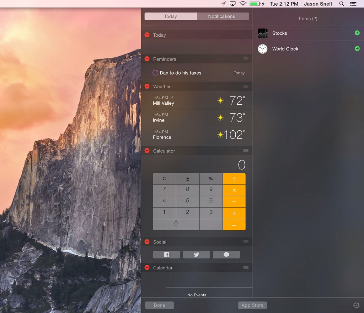
A new "Today" view in notification center that provides integration with third-party apps, a retooled spotlight search with new data sources, and new featured apps like Mail, Safari, and Messages.


   Apple says that new continuity features in Yosemite bring OS X and iOS closer together – 'perfect companions'. When your iPhone or iPad is near your Mac, a feature called Handsoff will let you start something on one device and then continue on another.


SMS and MMS messages on your iPhone will now appear in Messages on all your devices. You can  also reply from, and have phone calls through your Mac.


The new font loses a bit of elegance in its more jagged form, too. It's not hard to read, but it has definitely been designed with Retina in mind. Nothing here is so bad to be a show-stopper by any means, but there's no denying that OS X 10.10 is much more at home on Retina than not.
The Dark Mode is a nice touch in theory, turning some white elements of the OS dark black to make thing easier on the eyes in lower light level, but it's kind of only half a feature. It makes the Menu bar and Dock darker, but that's it - all the shiny light grey and white windows are still bright.
Another thing that can trip you up is that Apple has moved the 'fullscreen' button from the right-hand corner of a window to the green button on the top-left, which used to have the slightly nebulous function of fitting the window to the content. That functionality is still there if you hold alt and roll over the green button, though.
iCloud Photo Library on iOS 8 will take advantage of iCloud Drive, storing all of a user's photos in the cloud. Apple is working on a similar solution for Macs called Photos, which it plans to debut next year. While little information was available on Photos for Mac, it may also integrate with iCloud.

By Applogic IT Solutions India Pvt Ltd
 

Monday, 13 October 2014

Salesforce Hopes To Ride Analytics Wave With New Business Intelligence Service


Salesforce will unveil a new analytics service tomorrow morning they have dubbed Wave. 
The product will be introduced by CEO Marc Benioff at the company’s Dreamforce customer conference in San Francisco, but according to a Salesforce spokesperson, it is already available in the AppExchange now.
 
 
It was one of the worst kept secrets in technology as just about everyone I talked to knew about this even before today’s release, but the general consensus is that this is something that Salesforce had to do, even though the market is crowded with competitors and they are very late to the game.

        As one CEO told me, it was a gaping hole in the Salesforce product family and they needed to fill it. All that said, Wave is a graphical tool for viewing business analytic s in an attractive and visual way on mobile devices and larger PC screens, but like many of Salesforce’s services it will be rolled out slowly over time, and according to Forrester Analyst Boris Evelson, while it’s impressive in its own way, it has ways to go before it can compete with established business intelligence vendors.

        Make no mistake, this is a big market and a company like Salesforce wants some of it, but how large that piece will be is going to depend on many factors including how well they actually implement the product. Pretty demos always look nice, but it really depends on what happens when the rubber meets the road. Salesforce claimed when they showed this tool to business users, they were giddy because it was so easy to use, but the competition is fierce and Salesforce is just getting started.

       Still, IDC analyst Dan Vesset says you can’t dismiss Salesforce easily in what he estimates is a $10B market. In a market that large, he says, there is certainly room for Salesforce. “I think it can compete. Obviously, first and foremost it’s for existing SF.com customers. They now have an option to get their BI/analytics needs met by the same vendor instead of having to seek out another product. That will be attractive to some (not all),” he wrote in an email.


    The company emphasized in the demo that they wanted to make this a consumer-like experience, and they actually brought in game designers to make it more fun to use the product. While they succeeded to an extent, it’s important to remember this is still 1.0 technology and it’s going to require refinement over time.

    They also brought up the slew of third-parties who could be involved in this analytics play with everyone from OEMs to consultants to third-party developers. For a product that’s supposed to be so easy to use, it seems as though they’ve lined up a lot of outside help. To be fair though, they say the third parties will help customers connect to external data sources in other systems inside and outside the company and build more complex apps on top of the platform.

    Salesforce obviously wants a piece of the BI market badly and they are going to make a strong push to get it, but just because Salesforce enters the market, doesn’t mean it can have its way with it. If you recall, everyone thought Salesforce would blow up the enterprise social market when they introduced Chatter a few years ago, and it never really happened. Like everyone else in this space, it will need to earn its marketshare and that will take work and commitment. Today’s announcement is just the first step.


By Applogic IT Solutions India Pvt Ltd

Friday, 10 October 2014

Windows 10 ... what's new about it ?


Finally Microsoft unveils Windows 10 with lot more features.

Windows technical preview is now available in Microsoft website. Some of the major changes made by Microsoft in its new OS windows 10 includes.  

Start Menu, Microsoft brings back its standard start menu that we see in Windows 7 and older versions, but it adopts the metro style looks as seen in windows 8 versions.

So, finally we can see the same start menu with folders, nested menus , programs etc.


Virtual Desktops, In windows 10 we will have option of using virtual desktops. So, now we can have multiple desktops instead using single desktop. 


We can switch through them easily, this feature is present in Linux operating system and there some third party software s for windows OS, but it is available native in windows 10.

Now you can open apps on desktop, unlike opening apps in full screen in metro interface now we can open windows apps on desktop and we can perform minimize, maximize operations, that made easy for mouse-and-keyboard users .

Notification panel, in windows 10 technical preview we see there new notification panel that pops from bottom right corner.

The new notification panel has Flat UI interface. 


What more in new windows, new windows OS adapts more flattered interface look also task view interface also changed with flat interface style.


The Snap function is also being improved, so that windows can be easily tiled horizontally and vertically. It seems this also ties into the Task View interface, too.

The width of the window can be reduced, but there's no way to make it wider in windows 8.This changes in Windows 10. At long last it is possible to resize the Command Prompt window just like any other -- very handy for when you're typing out lengthy commands.

By Applogic IT Solutions India Pvt Ltd